


You’ve found the perfect image. You’ve picked your favorite mold. You’re ready to order a custom disc that will turn heads on the fairway.
But there is nothing worse than opening your mailbox and realizing the final product doesn’t look quite right. Maybe the image is blurry, or a face looks distorted right in the middle of the disc.
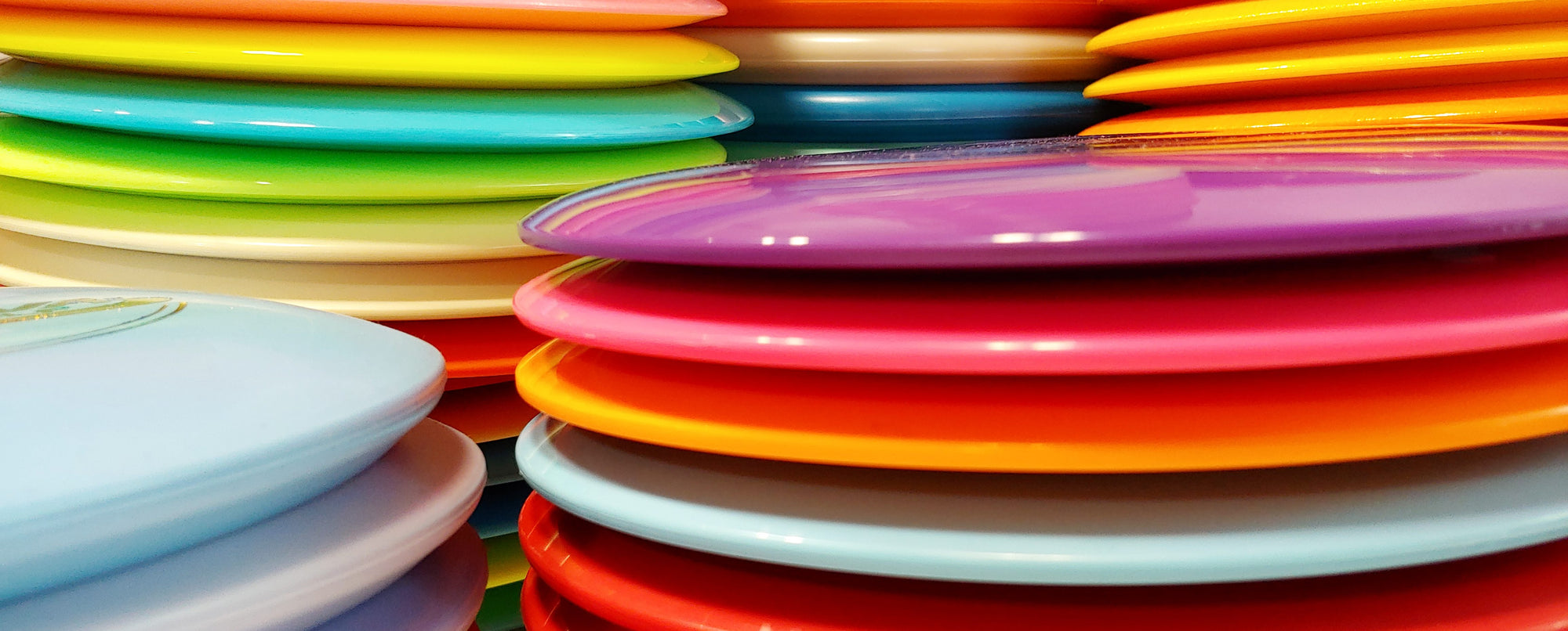
At Disc Golf Swag, we use specialized, high-definition printing technology to ensure your designs are crisp, durable, and vibrant. However, the final result is only as good as the file you upload.
To ensure your custom disc looks like a masterpiece and not a mistake, here are the three most common design errors we see—and how to fix them in seconds.
1. The "Bullseye" Blunder (Watch the Center Sprue)
Every golf disc is created by injecting molten plastic into a mold. This leaves a small mark in the dead center of the underside of the disc, often called the "sprue" or injection point. On many discs, this creates a slight dip, nipple, or dome on the top flight plate, too.
The Mistake: Placing a person’s face or a crucial detail of a logo directly in the absolute center of the design. The Result: The natural contours of the plastic can distort the image, making a person look like they have a strange nose or a "hole" in their forehead.

✅ The Fix: Offset your main subject slightly! If you are printing a face or a detailed logo, shift it just a half-inch off-center. This ensures the most important part of your image lands on the smoothest, flattest part of the flight plate.
2. The "White Box" Syndrome (Transparency Matters)
We primarily stock white discs for a reason: they act as a pristine canvas. Printing on white plastic guarantees that your colors stay vibrant and true-to-life, exactly like your original image.
However, we can special order almost any disc color or mold to meet your specific needs. This is where file preparation becomes critical.
The Mistake: Uploading a JPG file that has a white background behind the logo.

The Result: On our standard white discs, a white background usually blends in fine. But if you decide to special order a colored disc (like a neon Z-line or a blue Star plastic), that white background will print as a solid white box. It ends up looking like a cheap bumper sticker rather than a professional custom application.
✅ The Fix: Always use a PNG file with a transparent background. Even if you are printing on a white disc, a transparent background ensures the cleanest possible edge. If you don't have Photoshop, use free tools like Adobe Express or Remove.bg to delete the background in one click.
3. The "Screenshot" Trap (Resolution Rules)
We know it’s tempting to screenshot a funny meme on Instagram and upload it straight to our designer.
The Mistake: Using low-resolution phone screenshots or thumbnails.

The Result: Phone screens are small, so images look sharp to the naked eye. But when we stretch that image to cover an 8-inch diameter disc, the pixels stretch with it. The final result creates "jagged" edges, blurriness, or unreadable text.
✅ The Fix: Zoom in on the image on your computer screen. If it looks blurry to you there, it will look blurry on the disc.
-
The Golden Rule: Aim for an image that is at least 2000 x 2000 pixels.
-
Better yet: If you have vector files (SVG or AI), those are the gold standard for crisp lines.
Ready to Design?
Now that you know the secrets to a perfect design, you’re ready to build a disc that looks like it came straight from the factory.
Leave a comment
Also in The Disc Golf Journal


